Here I am, at home, going a little stir crazy. And being almost completely unproductive. RISD beckons...
Here's a sketchbook drawing/painting I made, inspired by a fragment of a dream I remembered from a few nights ago.
Friday, December 31, 2010
Sunday, December 19, 2010
see//taste wallpaper!
I made myself some computer wallpaper from my card back design. If you are so inlined, please enjoy it for your own computer as well! This version is intended for 1366x768 resolution, but in all likelihood it will look fine on other resolutions.
Friday, December 17, 2010
Lucian Freud Master Copy
I finished my master copy of Lucian Freud's Double Portrait this week and I'm fairly pleased with the outcome. Of course, the more I look at it, the more I see that needs tweaking, but for a three week effort it turned out alright.
Sunday, December 12, 2010
Friday, December 10, 2010
Fragment #10
It's 9am. I just finished this piece. Anticlimactic? Definitely. But I'm happy to have 10 pieces in my series, regardless. I'm not really capable of writing coherent sentences right now, so expect a post about the series as a whole some time in the near future.
I ran out of energy right in the middle of this one so I resorted to symbols. Fragment #10 is 100% acrylic paint.
Thursday, December 9, 2010
Fragment #8
I had to rush this one a bit. This time used acrylic wash, then used wintergreen oil transfers, then painted on top. PROCESS PROCESS PROCESS.
Wednesday, December 8, 2010
Monday, December 6, 2010
Saturday, December 4, 2010
Fragment #5
Thursday, December 2, 2010
Master Copy
I worked for a while on my final project for painting, a master copy. I chose a Lucian Freud painting titled "Double Figure". It is about 1 meter on each side, probably the second largest painting I have ever worked on. So far I haven't got much past the underpainting, but hopefully in two weeks it will look something more like the original!
![]() |
| Original painting (colours are a bit off) |
| poorly lit photo of my progress so far |
Tuesday, November 30, 2010
Several Card Concepts
Thursday, November 25, 2010
Fragment 4
Piece #4 my drawing series. Decided to break out my acrylics for this one. It just seemed right. I'm not quite happy with how the figures are interacting with the background, but I feel like I'm getting closer as a whole.
I started with a pen and ink skeleton study for the background and worked on top of that with first ink washes, then watery acrylic. I kind of lost the skeleton a bit, which is unfortunate because I rather liked it as a study. It was actually a huge pain to make because I was using a rusty nib - I don't recommend anyone else tries this. It turned out to be extremely labour-intensive and it would have been worth walking 20 minutes to the art store to get a fresh nib. Fortunately, I took a picture of the study before I began ink washes. Here it is, as it was today at 6am (when I went to bed).
❖ HPPYTHXGVNG EVRY1 ! ❖
| Fragment #4, Acrylic & Ink, 12.5" x 10" |
I started with a pen and ink skeleton study for the background and worked on top of that with first ink washes, then watery acrylic. I kind of lost the skeleton a bit, which is unfortunate because I rather liked it as a study. It was actually a huge pain to make because I was using a rusty nib - I don't recommend anyone else tries this. It turned out to be extremely labour-intensive and it would have been worth walking 20 minutes to the art store to get a fresh nib. Fortunately, I took a picture of the study before I began ink washes. Here it is, as it was today at 6am (when I went to bed).
❖ HPPYTHXGVNG EVRY1 ! ❖
Fragment 3
Piece number three! This one is almost reversing the approach of the other two by going for a high contrast, high detail background with more obscured figures. I'm going to explore this more in the next piece, although I have a hunch some reconciliation between the two methods will end up as the right way to go.
![]() |
| Ink & Gouache, 12.5" x 10" |
Wednesday, November 24, 2010
GIF(T)
I just learned tonight how to make animated GIFs in photoshop! Or any types of animation, for that matter. Please enjoy this pointless experiment / assault on the eyes. Images used are both mine, photo is of my good pal robbie.
Tuesday, November 23, 2010
Fragment 3 in alpha testing
Part one (background) of my third piece in the series. It's all rapidograph marks except for the strip on the right side. I liked how it is looking so far, so I decided to document this stage in the piece just in case I royally screw up something as I move forward. I'll be making some figures separately to cut out and place on top of the skull background. Not as morbid as it appears, promise!
| Ink, 12.5" x 10" |
Sunday, November 21, 2010
Fragment Two
Saturday, November 20, 2010
Fragment (repost)
(reposted due to a display error)
here is the first piece out of a series for drawing class that eventually must total to 1000sq" (or 2000sq"? I should probably resolve that). i'm still trying to figure out how to put the concept into words, but the basic idea is an exploration of how we as humans place so much value on social interactions, while our various friendships/relationships are quite insignificant when one considers the whole. in a world of 6.7 billion people, the importance of our social successes or failures dwindles to zero very quickly. my goal for the series is to depict various personal interactions, using colour to emphasize the structure of the human body -- as we are all simply human animals in an environment. depending on your point of view, it is either incredible or ridiculous that we so highly value banal interactions with other creatures of our species, often basing our goals and actions on expected social outcome.
but i digress into rambling. hopefully by the end of the series i will have a more concise explanation.
this one didn't turn out as expected, hopefully the next...twelve or so should go better. my process is pretty simple: ink wash and lines first, then watered-down gouache used with a pen nib for the skeletons. also, bad photo.
Gouache & Ink, 12.5" x 10"
here is the first piece out of a series for drawing class that eventually must total to 1000sq" (or 2000sq"? I should probably resolve that). i'm still trying to figure out how to put the concept into words, but the basic idea is an exploration of how we as humans place so much value on social interactions, while our various friendships/relationships are quite insignificant when one considers the whole. in a world of 6.7 billion people, the importance of our social successes or failures dwindles to zero very quickly. my goal for the series is to depict various personal interactions, using colour to emphasize the structure of the human body -- as we are all simply human animals in an environment. depending on your point of view, it is either incredible or ridiculous that we so highly value banal interactions with other creatures of our species, often basing our goals and actions on expected social outcome.
but i digress into rambling. hopefully by the end of the series i will have a more concise explanation.
this one didn't turn out as expected, hopefully the next...twelve or so should go better. my process is pretty simple: ink wash and lines first, then watered-down gouache used with a pen nib for the skeletons. also, bad photo.
Gouache & Ink, 12.5" x 10"
Thursday, November 18, 2010
Carmen Poster Assignment
Wednesday, November 17, 2010
concert review comic?
I'll post real work soon! This is just in the mean time!
Anyway, the following two page comic is about a concert i went to on monday. it was really just for personal enjoyment, re-living the experience i guess. if it is a bit confusing, here's a summary: heard about a show on monday, decided to go, really enjoyed some strange performances, got a bloody nose and a drumstick, loved life, went home. good times!
you have to fullview for it to be legible at all.
Anyway, the following two page comic is about a concert i went to on monday. it was really just for personal enjoyment, re-living the experience i guess. if it is a bit confusing, here's a summary: heard about a show on monday, decided to go, really enjoyed some strange performances, got a bloody nose and a drumstick, loved life, went home. good times!
you have to fullview for it to be legible at all.
Sunday, November 14, 2010
Nonsense Post.
I haven't been taking very many pictures of my work lately. So please enjoy these two random remnants from my brain this week. The first is another random printout gone wrong, the second is a comic I made while waiting around in studio about trying to stay awake in my 8am class. Better posts will follow soon, promise!
Friday, November 5, 2010
Obey Goobers
You'd think by November I'd have re-aligned the cartridges on my printer. But no. So right now my printer is in this weird limbo state of semi-functional where it gets colours wrong and puts stripes all over the image. Somehow I forgot about this, uh, special feature of my C4600 series and decided to print a photo. Rather than fixing the problem or printing my picture elsewhere, I wasted an hour or two playing around with printing multiple layers onto a single sheet of paper. Kind of like ghetto printmaking. The results were...surprising. I'll leave the value judgement up to you.
Anyway, this is one of the pieces I ended up with, I call it "Obey Goobers". This one is three layers of printing with limited outlining in micron. Weird stuff.
Wednesday, November 3, 2010
What creative process?
I thought a few people (ie my parents) might be interested in seeing some process images from my latest illustration assignment. The prompt was to create a New Yorker cover modeled after the original Eustace Tilley version. Our illustration class generally uses a two-week cycle of creation -- first week is concept sketches and second week is a finished product. For the first week, I submitted two digital sketches (see first two images in the triptych below). There's a lot of thinking behind each of them, but it suffices to say that they are both about bringing the character of Tilley to the digital age.
Unfortunately these ideas were not well received during group crit so I reinvented my idea to focus on Photoshop as a symbol for modern times. In photoshop, things are so quickly changed and their meanings inverted. It becomes a simple but chaotic process as toolbars and windows fill the screen; the process becomes unintelligible to anyone but the artist/manipulator.
What happens if we apply this to personal identity and style of the "hip" twenty-something?If Eustace Tilley is a symbol of the cultured, pensive individual, how would he feel obligated to dress or act today? Is changing one's attitude as simple as changing one's appearance to the outside world? These are the questions I wanted to evoke with my New Yorker cover.
The right-hand image is my first "draft" of the cover/screenshot. Below is my final piece after some revisions for clarity and composition.
Final image is an actual screenshot of a photoshop workspace with several small alterations (blue bar on left, mouse, etc.). I didn't quite accomplish what I was going for with this piece, but this kind of digital method left me pensive and curious to try again.
Hope this was, if not interesting, at least informative!
Sunday, October 24, 2010
Wednesday, October 20, 2010
Saturday, October 16, 2010
Baby's First Oil Painting
I finished my first oil painting this week! I enjoyed oil painting a lot more than I expected to, and I'm pretty happy with the outcome. This was a three week process: underpainting, approximate hues/tones, then the final push. I wish I'd had another session to tighten things up, but all in all I'm glad I'm getting the chance to play with oil paints!
Sunday, October 10, 2010
Online Portfolio!
I went to a career building program last week and they highly recommended putting up a simple online portfolio to begin gathering attention on the web. I made mine last night, check it out!
Saturday, October 9, 2010
The Question Arises: Will I ever post something other than illustration?
This week's prompt: depict fear, anger, or joy using only figures and abstract elements. Naturally, I chose to show a peaceful zombie scene.
Approx 13"x15"
Monday, September 27, 2010
Moar Illustration
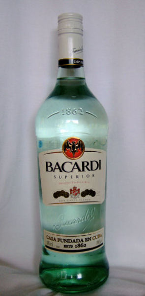
This week's illustration project: convey sadness, anger, or joy through an illustration devoid of figures, animals, or clothing with a monotone palette. I decided to try and tell a story in my image to accomplish this, perhaps of a man receiving a letter with devastating news (a break up, a death, etc) who drowns his sadness in alcohol. Or something like that. It's open to interpretation.
Note to parents: Fear not, I do not own the bottle depicted in my painting. I extrapolated from this image I found on google.
Gouache on Bristol, approximately 14"x15.5"
Thursday, September 23, 2010
Back at the Rhodes School of Island Design
Thursday, August 26, 2010
Monday, August 23, 2010
WSA Web Refresh
Friday, August 20, 2010
Stompbox Business Card Design
Tuesday, August 10, 2010
Senior Citizens 2011
This year I was again invited to design the senior sweatshirt for my alma mater, West Sound Academy. As with the previous years, the most difficult part of the design process was getting everyone to agree on an idea. Which actually didn't happen this year, so the seniors now have a choice between a normal hooded sweatshirt with a design inspired by Macklemore's My City's Filthy shirt and a zip up hoody with a simple (BORING!) logo. Here's what I came up with:
Saturday, July 31, 2010
Wait, I actually finished something?!
I felt extremely guilty about not finishing my second page yet and had some excess energy so I finally inked my last panel! Woo! Unfortunately my scanner is far too small to be of use and the lighting is terrible right now so the image is pretty low quality, but I'll fix that later. SO PLZ ENJOY PAGE TWO OF MY UNNAMED COMIC!
Friday, July 30, 2010
WHY AM I SO BUSY ALL THE TIME
WHYYY???? But seriously I feel like I have things scheduled for every single day of my life right now. Anyway I still have that second page of my comic laying around with the same one unfinished panel as before. It's even drawn in, just not inked. I suck. Fortunately I was spurred to make a drawing for my fellow artist Helena as part of a quick art trade! Hooray! I drew her as one of my zombie characters and she drew me an excellent picture of me as a pirate riding a narwhal. THANKS HELENA! 

I haven't worked in photoshop for a long time and damn, does it show. I'm glad I got around to picking up ye olde tablet again but its obvious that I need to dedicate more time to making character designs, etc in the program. I have about 1000 projects I would like to be working on but since I have so many other things going on in my life right now it's hard to sit down and focus on just one! Hrmf.
Subscribe to:
Posts (Atom)